Dubai – Qahwa World
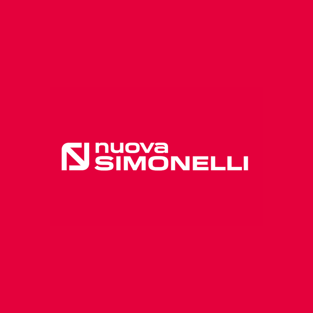
Nuova Simonelli has officially revealed its new logo — an evolution that respects the brand’s deep heritage while embracing a modern vision for the future. The refreshed design preserves the company’s distinctive monogram that unites the initials “N” and “S,” symbolizing the harmony between innovation and tradition that has defined the Italian espresso machine manufacturer for nearly a century.
“For more than 90 years, the Nuova Simonelli logo has reflected craftsmanship, reliability, and progress,” the company stated. “Each transformation has mirrored the times, while remaining true to the essence of who we are.” The new emblem carries forward this legacy in a refined, contemporary form — one that positions the brand for its next era.
A Legacy Rooted in Design and Innovation
Founded in 1936 under the name Simonelli and renamed Nuova Simonelli in 1972, the brand has long stood for easy-to-use, technologically advanced espresso machines. Today, its products are found in cafés, restaurants, and hotels in over 125 countries. “When we acquired the trademark, we chose to keep the name Simonelli as a sign of respect for that pioneering phase,” recalled Nando Ottavi, Chairman of Simonelli Group. “Nuova Simonelli represents both continuity with our origins and a look to the future.”
The original monogram was designed in 1975 by industrial designer Carlo Viglino during the launch of the company’s first truly modern espresso machine, the ISX. “I started with the initials N and S, placing them inside a grid to build the frame and proportions,” Viglino explained. “I superimposed the two letters, softened the corners, and created a single monogram that symbolizes unity between innovation and tradition.”
The symbol, he added, can also be seen as two arrows expanding outward — a “prophetic sign” of a brand destined for global recognition. Viglino paired this with a clean, legible logotype to reflect the simplicity and precision of Nuova Simonelli machines.
Evolution Through the Decades
Since its creation, the monogram has been featured on every Nuova Simonelli espresso machine. The company made slight updates over time — introducing the red color and tagline in the 1990s, refining the design during the launch of the Aurelia series in 2003, and later returning the monogram to its original upright position with a renewed payoff.
Now, in 2025, Nuova Simonelli’s new logo represents a seamless bridge between past and future — a modern refinement of a design born from Italian ingenuity and a passion for espresso excellence. It reflects not only a visual evolution but also the brand’s enduring commitment to innovation, craftsmanship, and global leadership in the world of coffee.
